Tutorial
These tutorials describe how to use the maps, adjust visualizations, and compare data across geographies on the Profiles page.
Choosing a Visualization Style
The Bay Area Energy Atlas provides interaction with the underlying data through the map pages as well as the Profiles page. The maps enable users to view the data geospatially, whereas the Profiles page allows users to directly view, compare, and aggregate data for specific energy use across all available data categories (Building Type, Size, Vintage, Area Median Income, and Calenviroscreen score).
Mapping Options
How do I change the data displayed on the map?
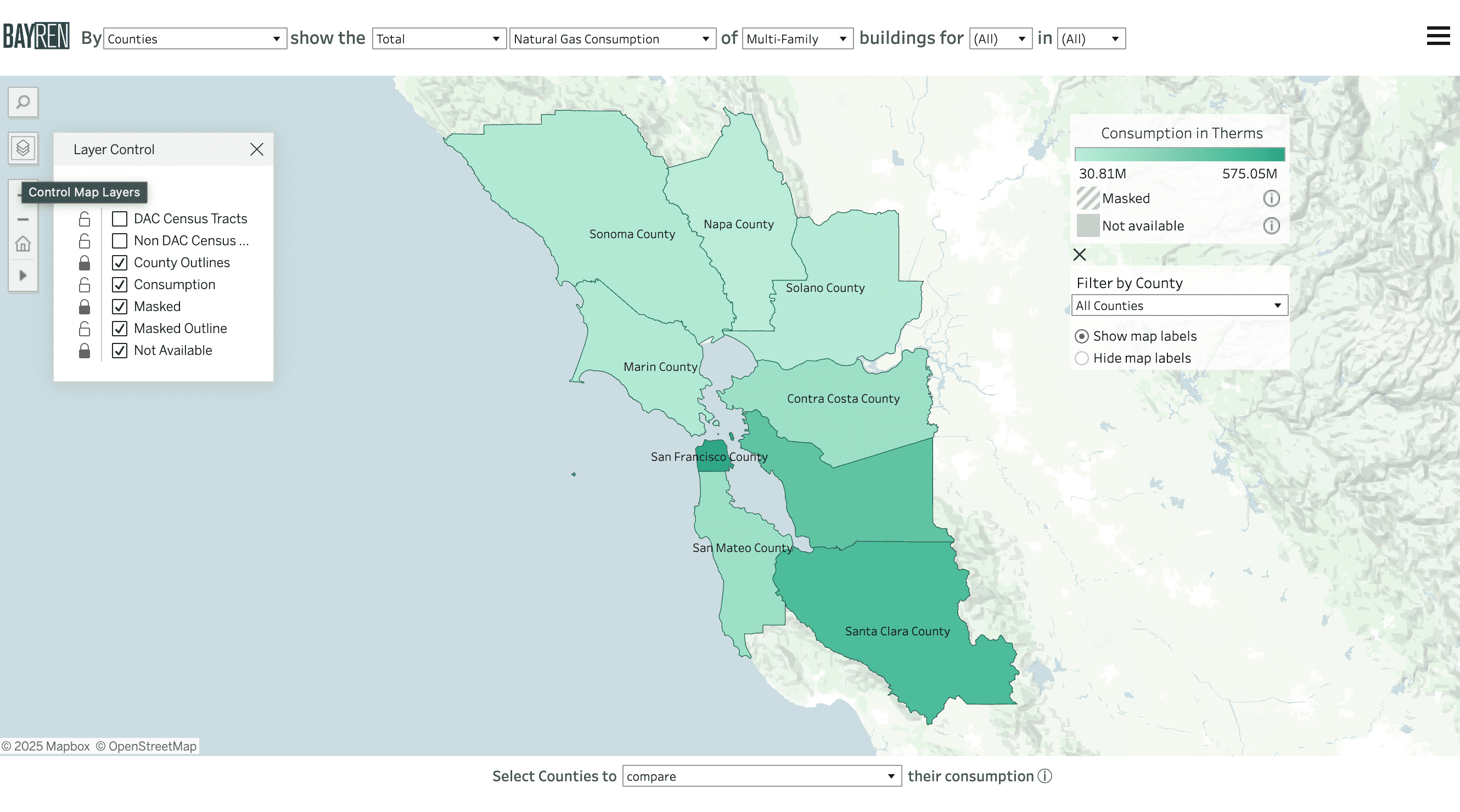
There are four map views you can interact with on this website: Map by Building Type, Building Size, Building Vintage, and Residential Income. Navigating to each map will allow you to change different variables.
Open the map of interest from:
- The Bay Area Energy Atlas home page. Select which of the four variables you would like to visualize.
- The Menu in the upper-right corner. Select or change maps in the top half of the menu.
How can I customize the map?
For each map, use the drop-down options above the map to customize what you would like to see. The following four sections detail which variables are available for each map.
Map by Building Type
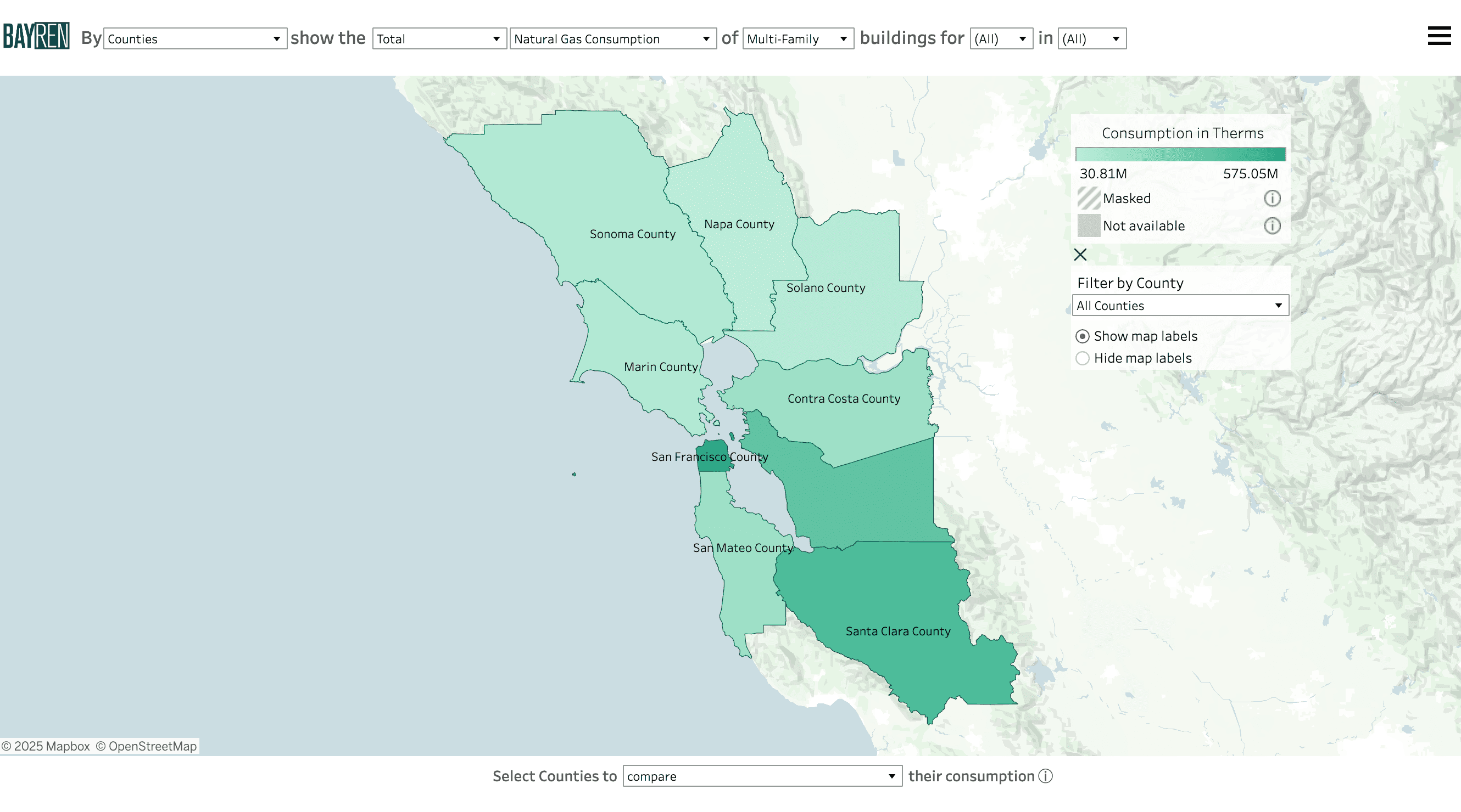
- The leftmost dropdown controls the geographical scale, including Census Tracts, Cities, Zip Code Tabulation Areas, Unincorporated Counties, and Counties.
- The second dropdown menu allows for selection of the frequency distribution, by changing to Total, Median, Median per square foot, and Per Capita.
- The third denotes the energy type: Electricity Consumption (kWh), Combined Consumption (Btu), and Natural Gas Consumption (therms).
- The fourth menu displays the specific building category, which includes the following: Agricultural, Commercial, Industrial, Institutional, Multi-Family, Single-Family, Other, and Unknown.
-
The final two menus allow month and year selection. Any combination of months and years may be selected.
- NOTE: When multiple months and/or multiple years are selected for a statistical distribution (Median, Median Per Sq. Ft., Per Capita), the values displayed in the map will show the monthly median of those values for the time periods selected. This happens because the statistical values are precomputed in the confidential backend of the database. Multiple selections will also trigger a boxplot in the time series graph when the aggregate option is selected. When Total is selected, the map and graphs will display the sum over the time periods selected.
Map by Building Size
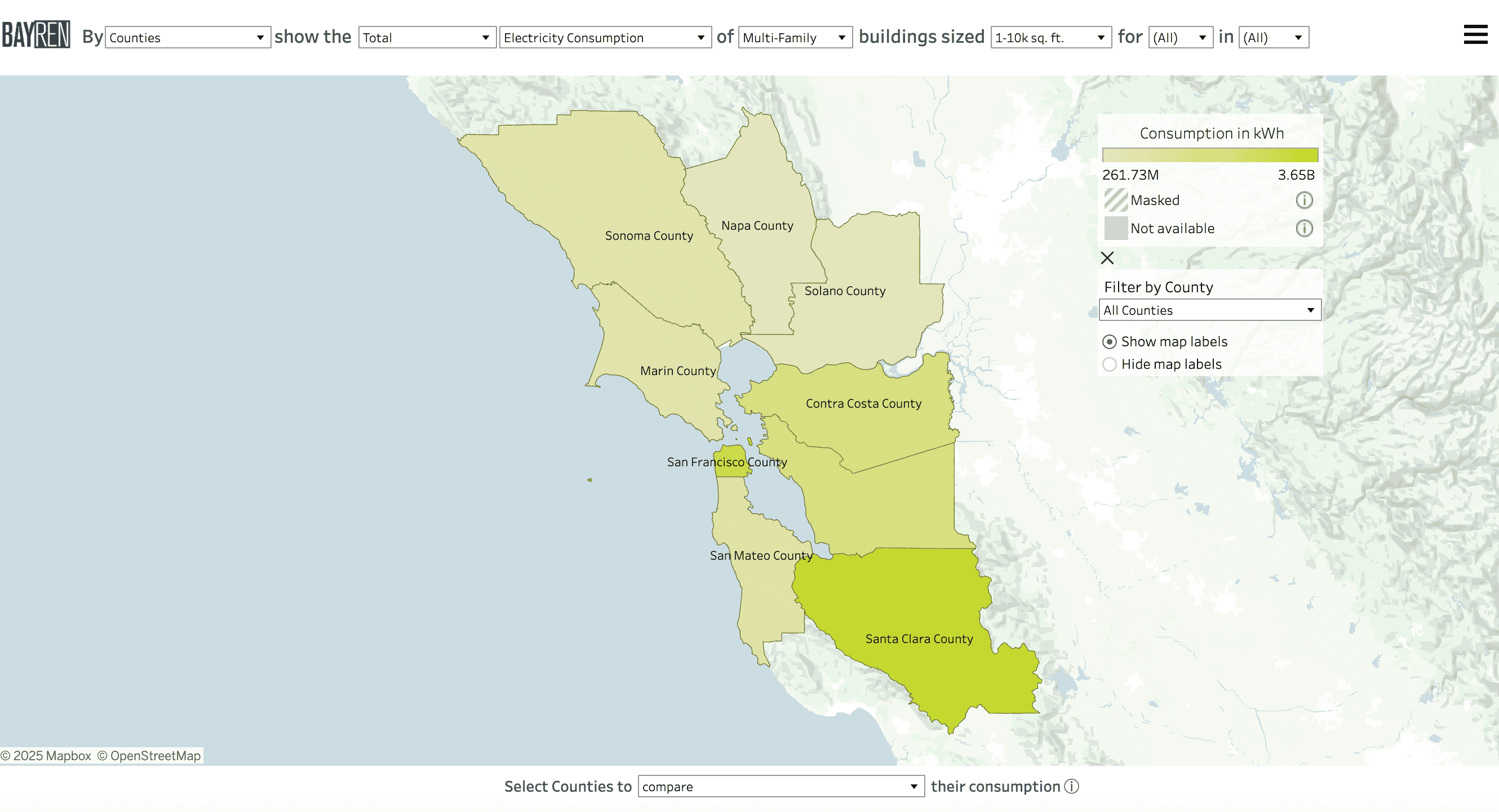
- The leftmost dropdown controls the geographical scale, including Census Tracts, Cities, Zip Code Tabulation Areas, Unincorporated Counties and Counties.
- The second dropdown menu allows for selection of the frequency distribution, by changing to Total, Median, Median per square foot, and Per Capita. The third column denotes the energy type: Electricity Consumption (kWh), Combined Consumption (Btu), and Natural Gas Consumption (therms).
- The fourth menu displays the specific building category, which includes the following: Agricultural, Commercial, Industrial, Institutional, Multi-Family, Other, and Unknown.
- The fifth dropdown allows you to select the building square footage: 0-10k sq. ft., 10k-20k sq. ft., 20k-30k sq. ft., 30k-40k sq. ft., 40k-50k sq. ft., Over 50k sq. ft., and Unknown.
-
The final two columns allow month and year selection. Any combination of months and years may be selected.
- NOTE: When multiple months and/or multiple years are selected for a statistical distribution (Median, Median Per Sq. Ft., Per Capita), the values displayed in the map will show the monthly median of those values for the time periods selected. This happens because the statistical values are precomputed in the confidential backend of the database. Multiple selections will also trigger a boxplot in the time series graph when the aggregate option is selected. When Total is selected, the map and graphs will display the sum over the time periods selected.
Map by Building Vintage
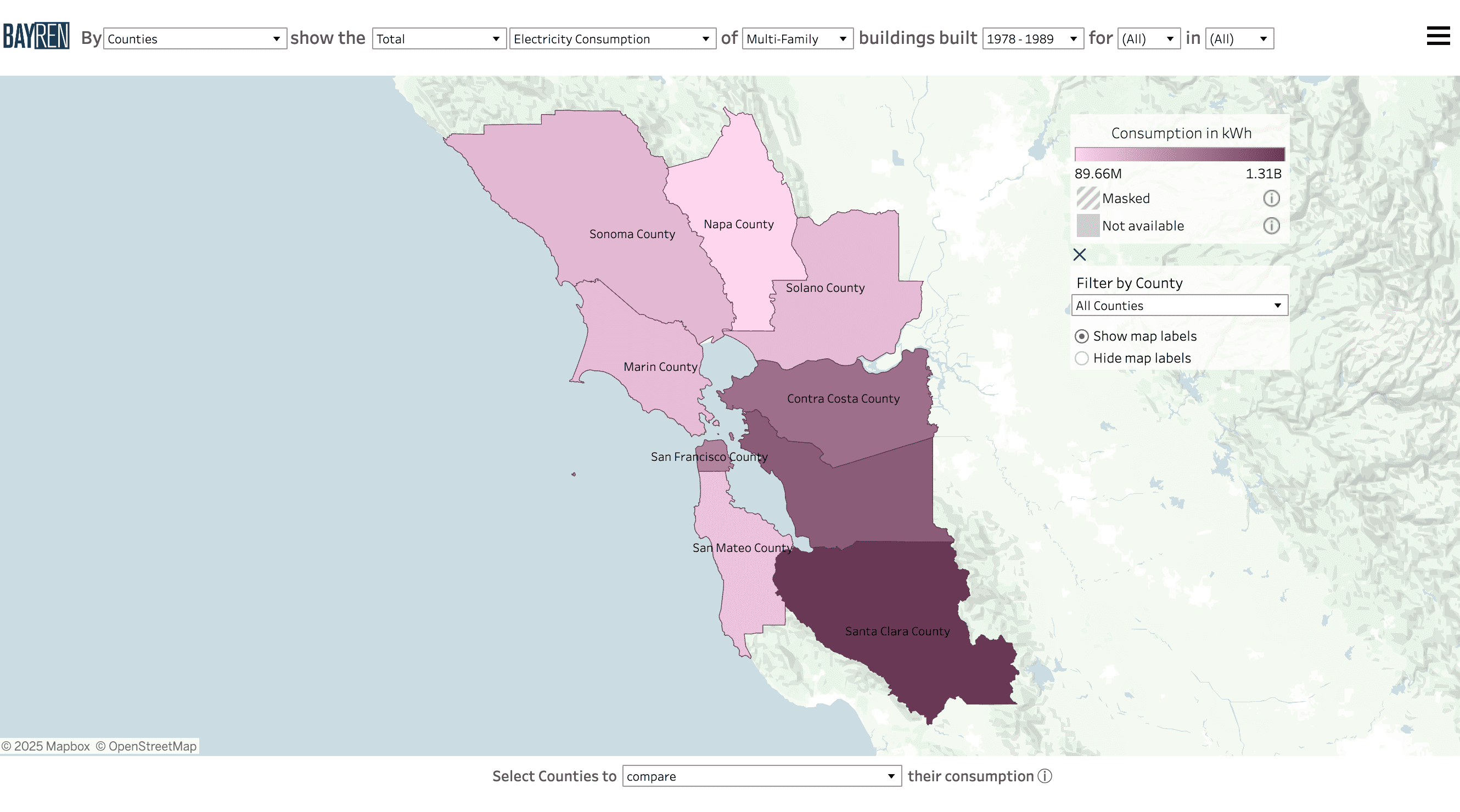
- The leftmost dropdown controls the geographical scale, including Census Tracts, Cities, Zip Code Tabulation Areas, Unincorporated Counties and Counties.
- The second dropdown menu allows for selection of the frequency distribution, by changing to Total, Median, Median per square foot, and Per Capita.
- The third menu denotes the energy type: Electricity Consumption (kWh), Combined Consumption (Btu), and Natural Gas Consumption (therms).
- The fourth menu displays the specific building category, which includes the following: Agricultural, Commercial, Industrial, Institutional, Multi-Family, Single-Family, Other, and Unknown.
- The fifth dropdown allows you to select the time period in which buildings were built: Before 1949, 1950-1977, 1978-1989, After 1990, and Unknown.
-
The final two columns allow month and year selection. Any combination of months and years may be selected.
- NOTE: When multiple months and/or multiple years are selected for a statistical distribution (Median, Median Per Sq. Ft., Per Capita), the values displayed in the map will show the monthly median of those values for the time periods selected. This happens because the statistical values are precomputed in the confidential backend of the database. Multiple selections will also trigger a boxplot in the time series graph when the aggregate option is selected. When Total is selected, the map and graphs will display the sum over the time periods selected.
Map by Residential Income
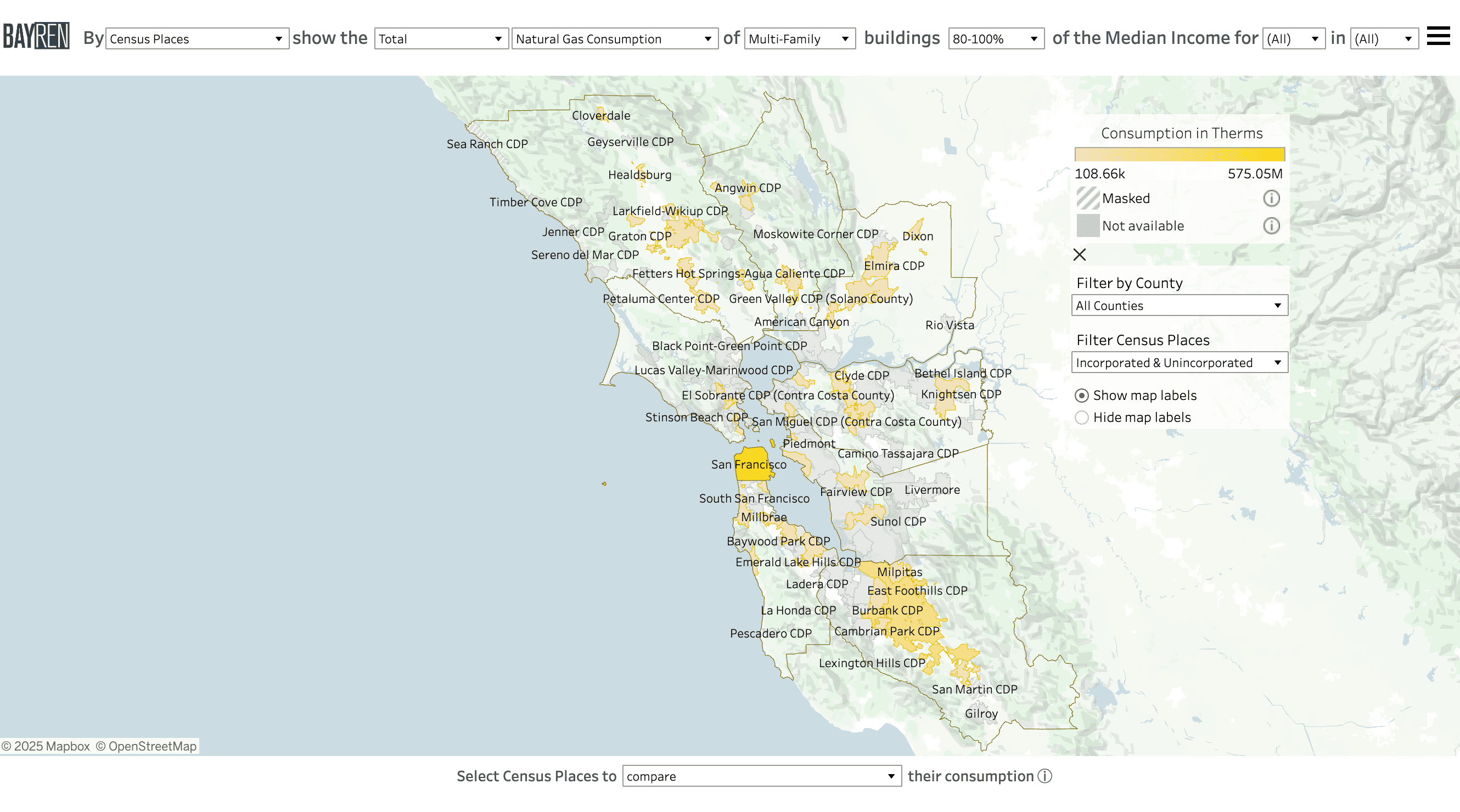
- The leftmost dropdown controls the geographical scale, including Census Tracts, Cities, and Zip Code Tabulation Areas.
- The second dropdown menu allows for selection of the frequency distribution, by changing to Total, Median, Median per square foot, and Per Capita.
- The third column denotes the energy type: Electricity Consumption (kWh), Combined Consumption (Btu), and Natural Gas Consumption (therms).
- The fourth menu displays the specific building category, which includes the following: Multi-Family and Single-Family.
-
The fifth column allows you to select the percentage range of the area median income: 0-30%, 30-50%, 50-80%, 80-100%, 100-120%, Over 120%, and Unknown.
- NOTE: The tooltip that appears when hovering over the map geographies will indicate from which area the median income has been derived, as well as the median income of the geography being examined.
-
The final two columns allow month and year selection. Any combination of months and years may be selected.
- NOTE: When multiple months and/or multiple years are selected for a statistical distribution (Median, Median Per Sq. Ft., Per Capita), the values displayed in the map will show the monthly median of those values for the time periods selected. This happens because the statistical values are precomputed in the confidential backend of the database. That will also occur in the time series graph when the aggregate option is selected. When Total is selected, the map and graphs will display the sum over the time periods selected.
Using the Maps
How do I control the visibility of map layers?
These layers may be toggled using the map controls available on the left side of the map.
While all layers are technically available to toggle off and on, we recommend maintaining the visibility of the Consumption layer when multiple months and years of consumption data are available. Users will only get accurate information about consumption and masking for the entire time period when the Consumption layer remains visible.
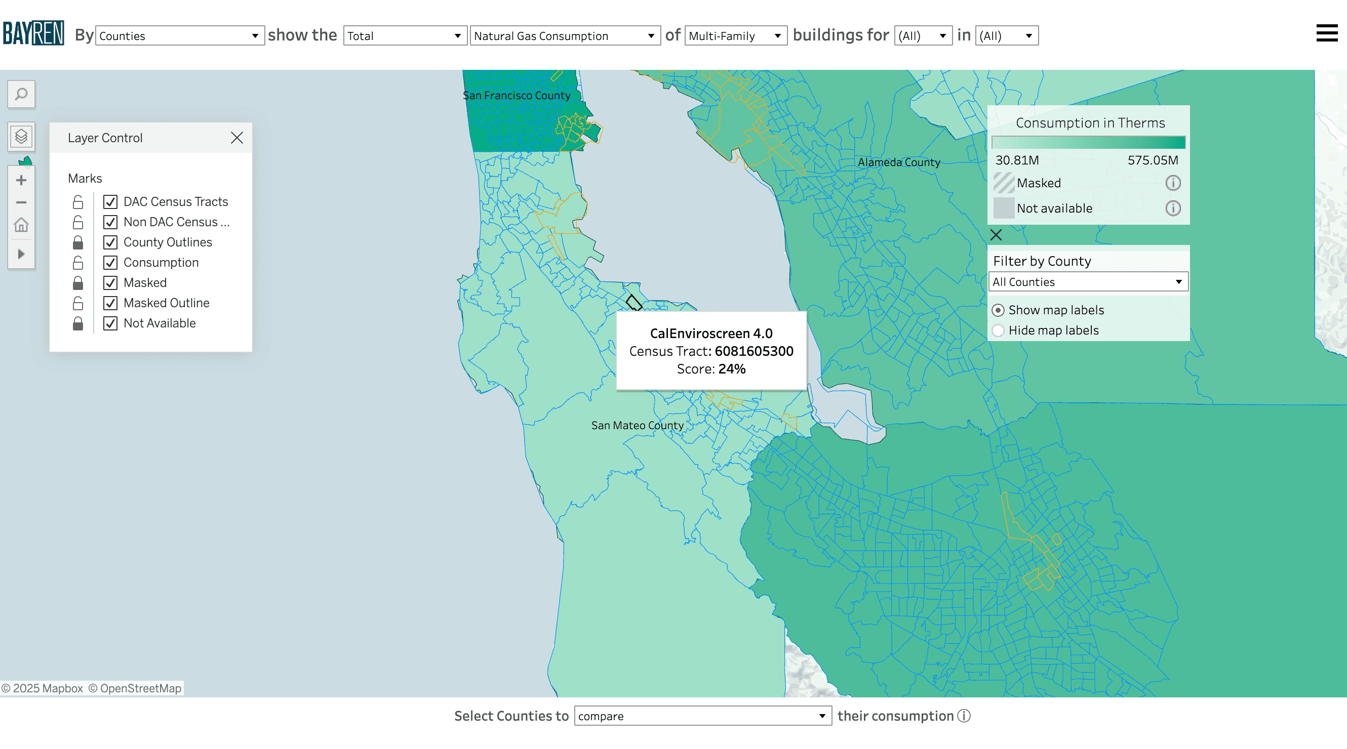
Map layers of DAC and Non-DAC census tracts derived from CalEnviroscreen 4.0 are available as context layers. When turned on, their tooltips will be prioritized upon hover. These map overlays are available separately to increase the flexibility of the layer control.
How can I interact with the maps?
Each interactive map will have shared and unique variables available for adjustment at the top of the window. The options are described in the section How can I customize the map?
In addition to the filter selections available at the top of the map, there is a menu of extra map controls below the legend. When viewing the map, you can use the “Filter to: [County]” dropdown to view only the geographies that intersect or lie completely within a county of interest.
Below the filters is an option to show and hide map labels, which may be useful when examining consumption of the more granular geography levels.
The menu can be collapsed by clicking the “X” on the top left of the Extra Map Controls.
How do I get a data summary and consumption breakdowns for specific regions?
You can get a data summary and see consumption data for a specific geography through any of the interactive maps or by going straight to the Profiles page, located in the main menu.
In an interactive map:
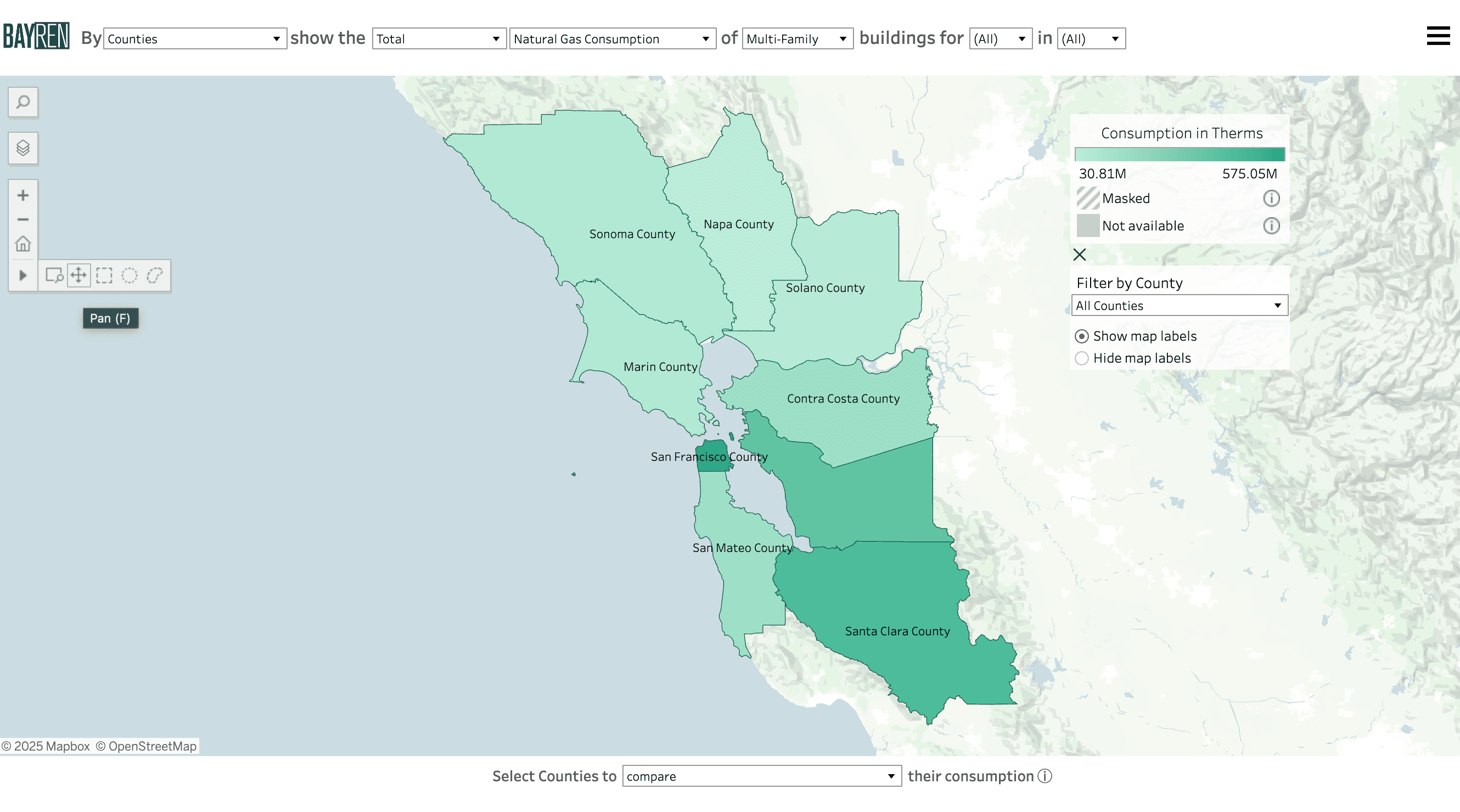
There are two ways to make selections on a map page, which can be found in the map control panel on the left of the window.
-
The default option is the “Pan” function, which allows you to move around the map and make selections by clicking on the geography of interest. To select multiple geographies at a time, hold the Ctrl button (Windows) or the command button (Mac) while clicking on the geographies of interest.
-
Use the “lasso” options, which allow you to click and drag to make a shape. All geographies within the shape will be selected.
You will see a time series graph with monthly data and a data summary pop up for your selection(s) at the bottom of the screen.
- NOTE: While you can select as many geographies as you’d like, we suggest no more than 3 or 4. Depending on the size of your screen, results may be obscured with larger selections.
To make a new selection, simply click a new geography (without the ctrl or command button) or use a lasso selection tool. To clear a selection, either Ctrl (Windows) or command (Mac) and click the geography you want to unselect. Alternatively, to clear the entire selection, click anywhere on the map that is outside the included geographies.
- NOTE: If the data summary is available at the bottom of the screen, you have at least one geography selected. The website will maintain your selection when you navigate to the Profiles page via the View Profiles navigation button on the top left of the data summary.
Time Series Graph
For each selected geography, the graph in the bottom of the window will show the consumption for each selected month of each selected year. Below the time series graph, a data summary for the geographies will also be available.
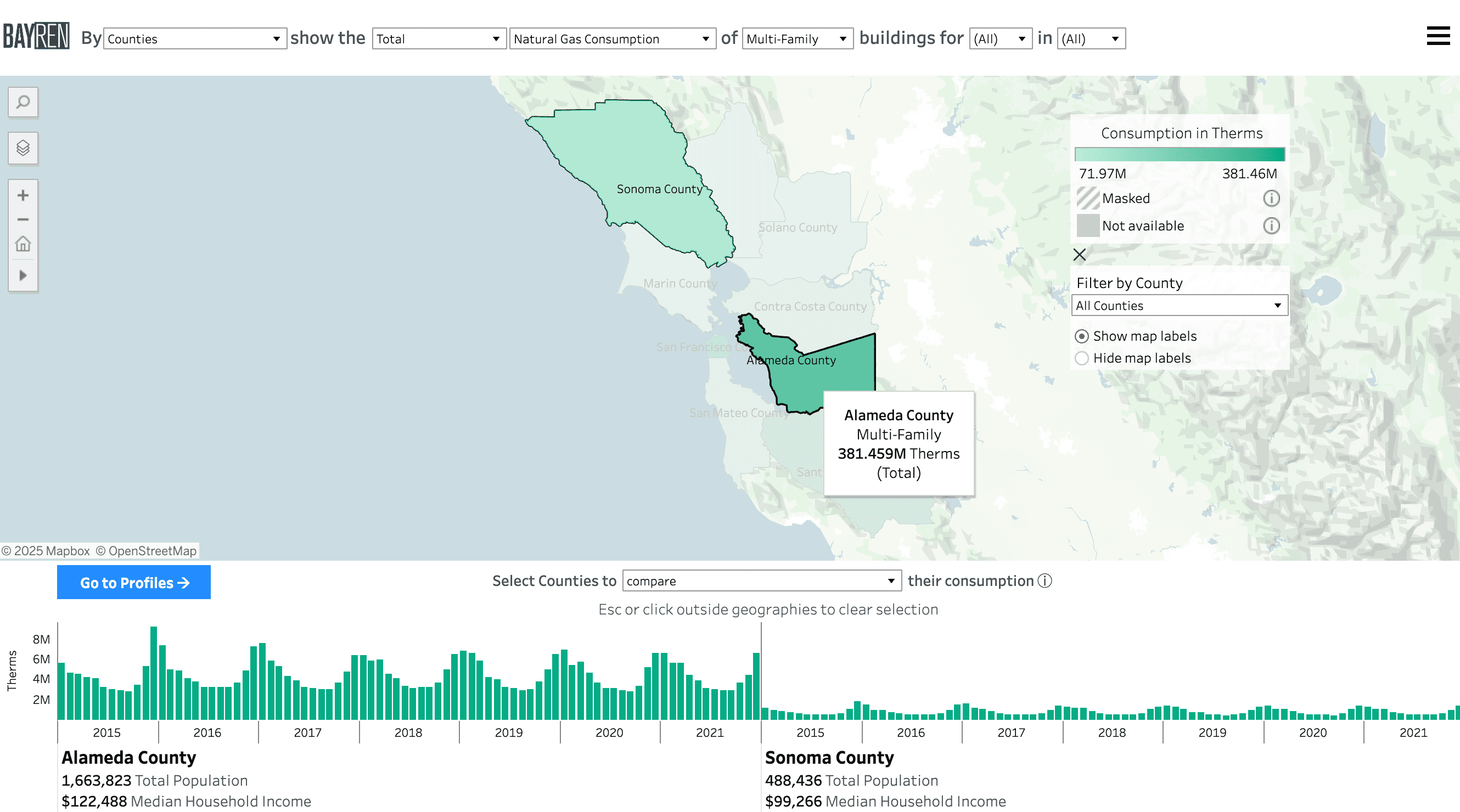
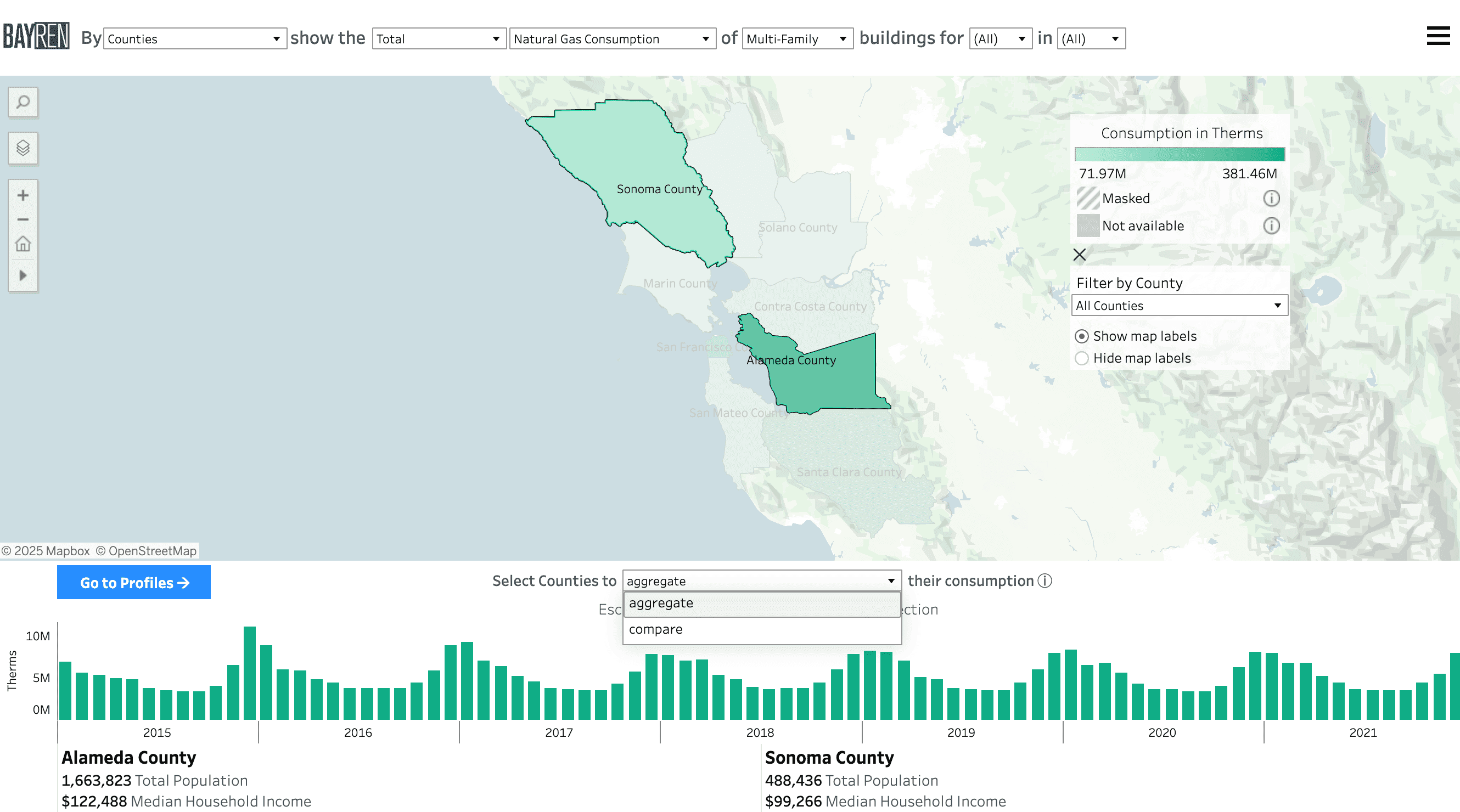
With geographies selected, there is an option to compare or aggregate the data in the graph through a dropdown available at the bottom of the map. When comparing geographies, the graphs will sit side-by-side.
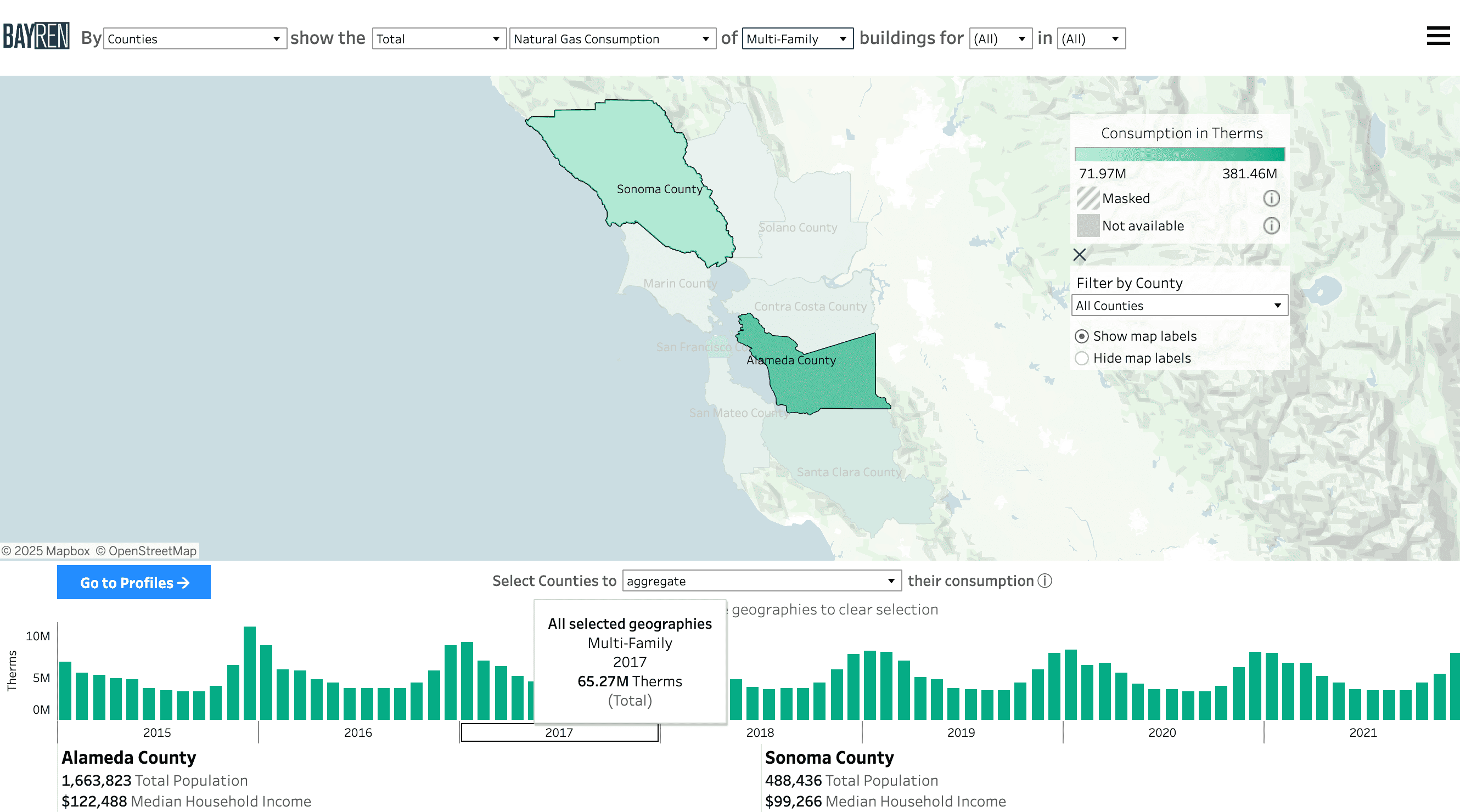
When aggregating, a single graph will display while maintaining separate data summaries for each selected geography below the graph.
- NOTE: When viewing consumption as a statistic (median, median per sq. ft., per capita) in the aggregation state for multiple geographies, a boxplot will be triggered.
How do I interpret masking in the graph?
When aggregating geographies in instances where masking is present, the aggregated graph will maintain a masking flag (a gray “x”). The flag indicates that the aggregation is incomplete due to the presence of masking in at least one of the geographies.
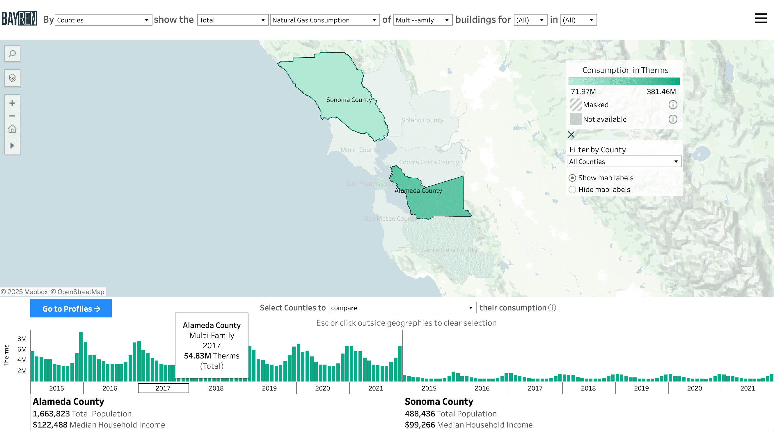
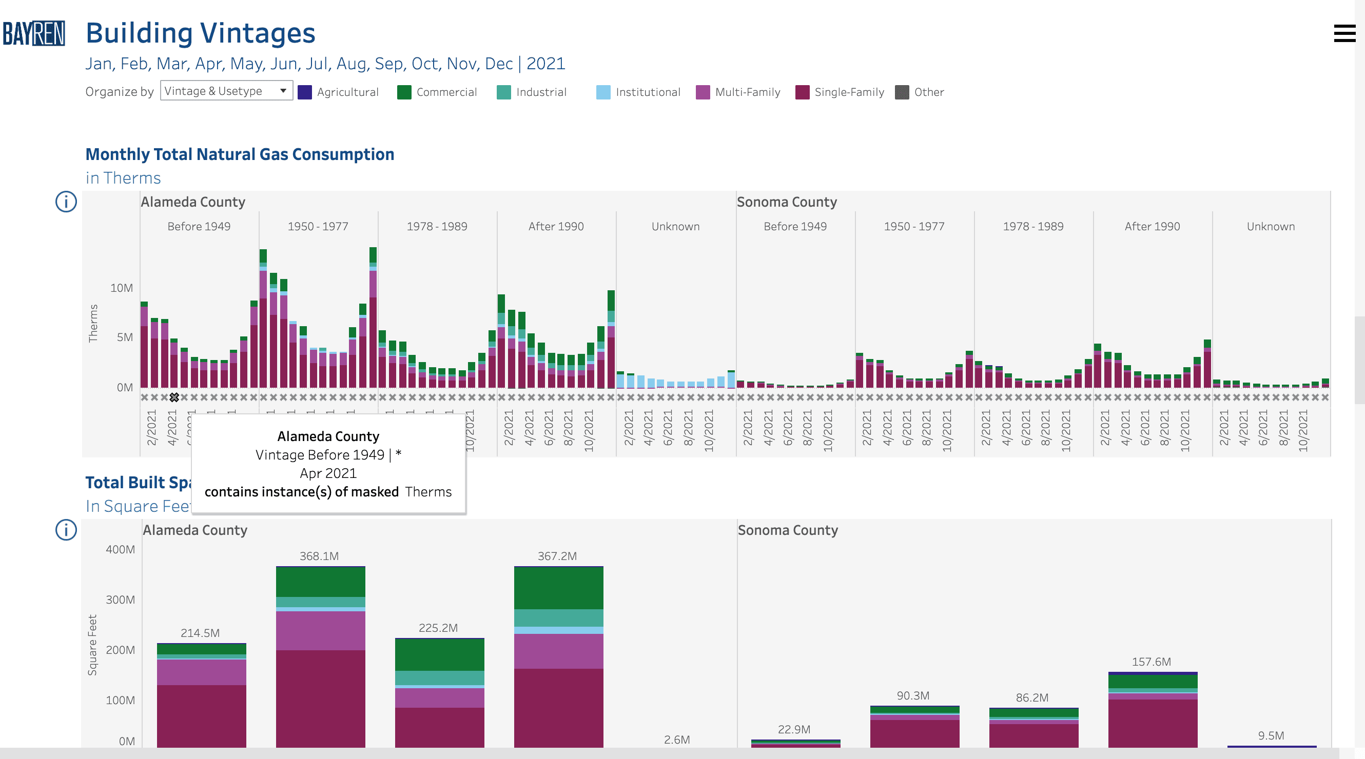
As an example, below is the Building Type map with Sonoma County and Alameda County selected using the compare option. With the Industrial use type selected, masking is present (indicated by a gray “x”) across multiple months of the Sonoma County data.
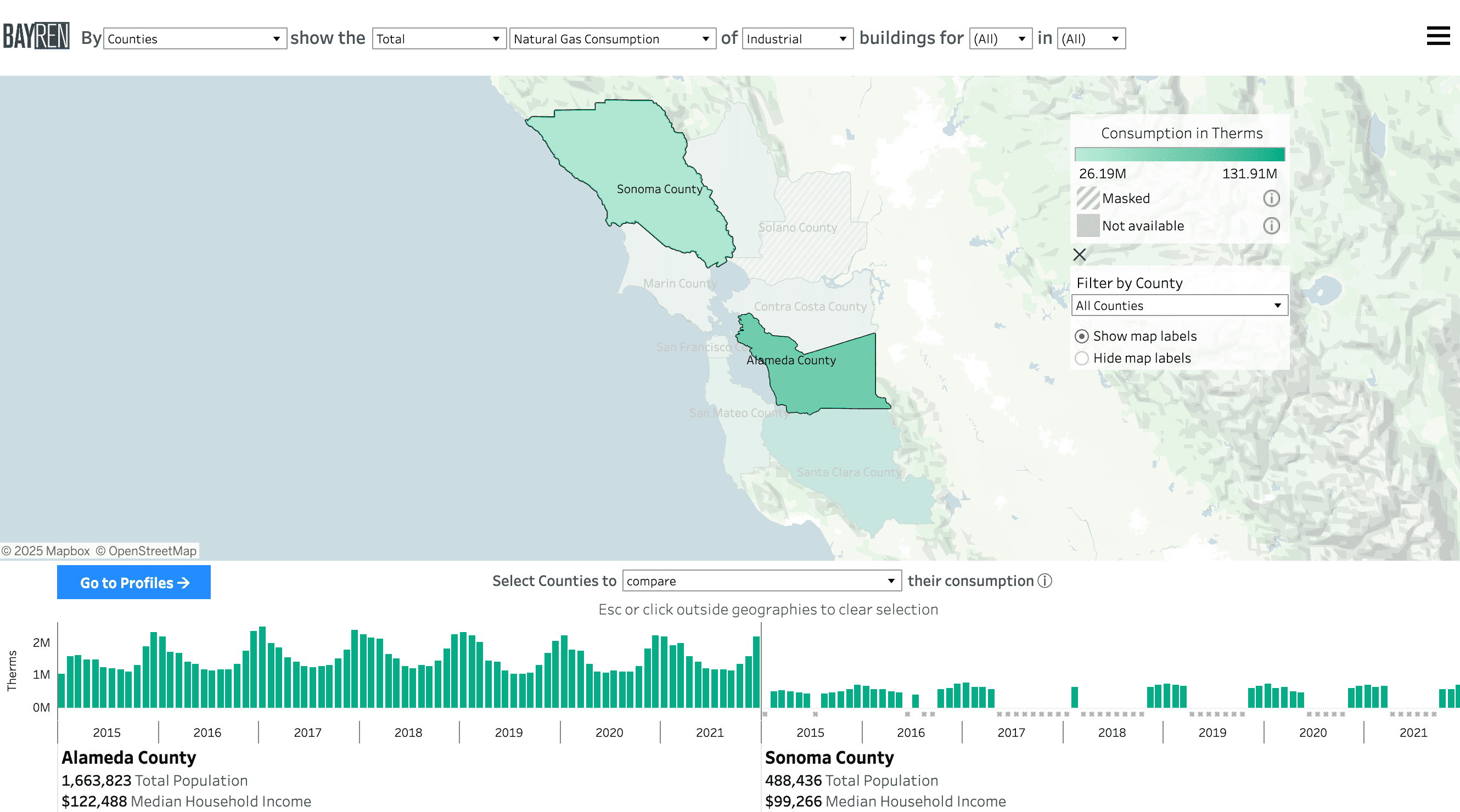
When the aggregate option is selected, the masking indicator will remain present below the appropriate bar in the graph for the months in which Sonoma County consumption is masked.
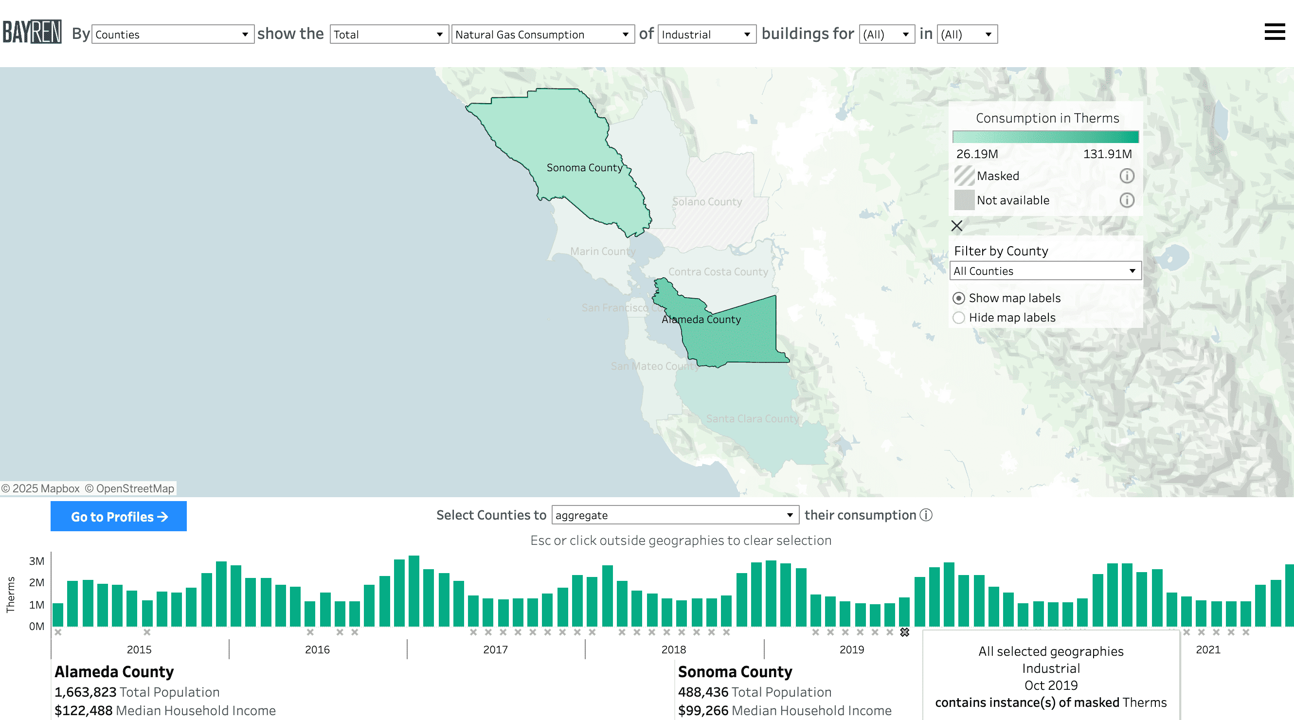
This feature is meant to maintain transparency as aggreggations in the public atlas are calculated with data that has already been masked to abide by privacy rulings (learn more in the Methods page).
How do I make selections in the graph?
Selections in the graph are available when viewing the Total value of a metric. When hovering over the year value in the x-axis of the graph, the aggregate consumption value for the entire year will display in the tooltip.
To aggregate specific months and years of interest for the tooltip, you can:
- Click and drag to create a rectangle selection of the months of interest in the time series graph
- Ctrl (Windows) or command (Mac) and click individual months of interest
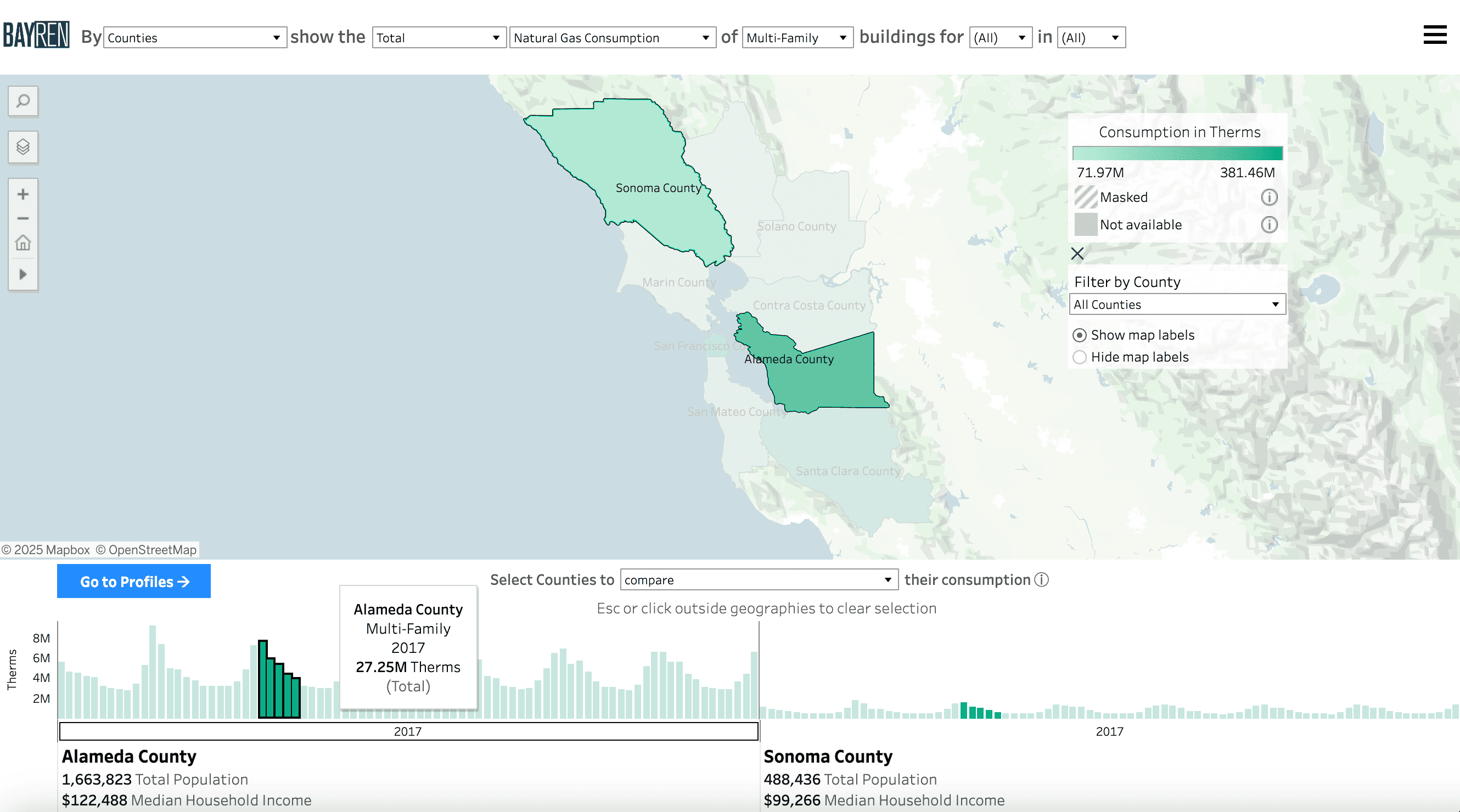
The selection will filter to only the selected months and years and update the aggregation displayed in the yearly tooltip along the x-axis of the graph. When viewing the graphs with the compare option selected, a selection made in the graph of a particular geography will also filter and update every other geography represented in the graphs.
To clear the selection, click on any white space within the graph window or begin a new selection.
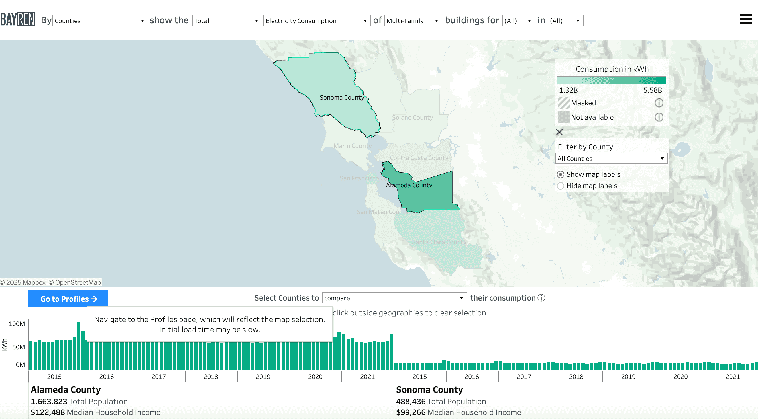
How do I enter the Profiles page through the map?
With at least one geography selected, a “Go to Profile” or “Go to Profiles” button will appear in the top left of the data summary window, which will take you to the Profiles page with your selected geographies.
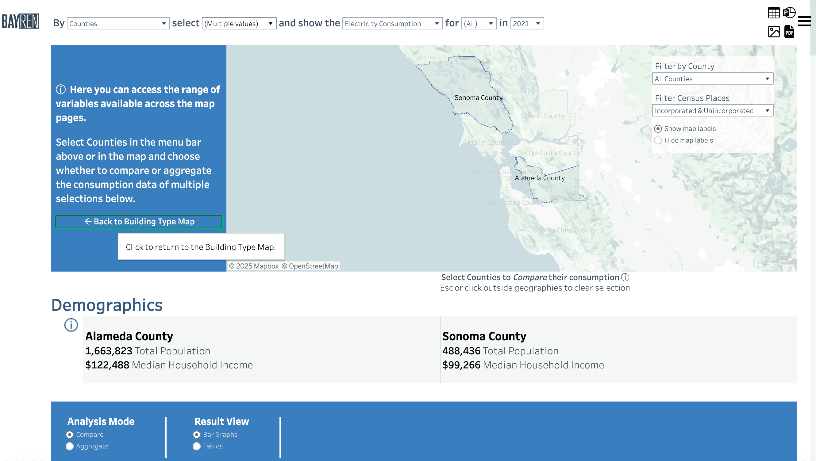
When you have navigated to the Profiles page directly from a map page, there will be a highlighted button in the left-hand block of blue text that will allow you to return to the map page.
More information on the Profiles page is available in the next section.
Profiles
How do I compare profiles?
If you have selected a geography from a map, and navigate to the Profiles page via the Go to Profiles button, all the available visualizations and data summaries in the Profiles page will be populated with the selection.
You can also navigate to the Profiles page independently of the map, by using the Menu in the upper-right corner of the window. When you enter the Profiles page without a map selection, the graphs will be unpopulated until a selection is made in the map or the top filters.
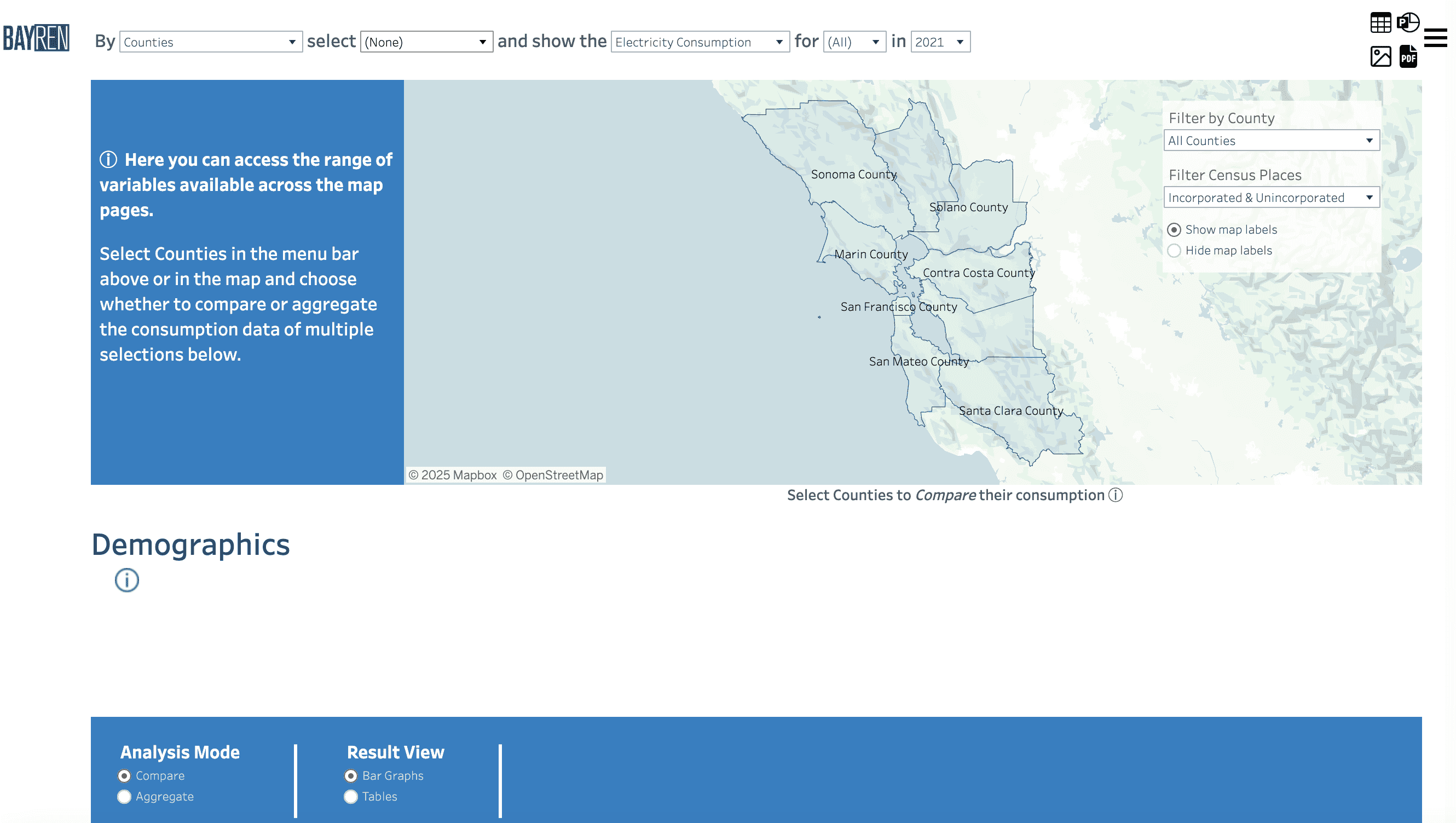
- The leftmost dropdown filters the geographical scale, including Census Tracts, Cities, Zip Code Tabulation Areas, Unincorporated Counties and Counties.
- The second option allows you to choose specific geographies to select. This dropdown will update depending on the selected geographic level as well as the county filter.
- The next column denotes the energy type: Electricity Consumption (kWh), Combined Consumption (Btu), and Natural Gas Consumption (therms).
- The following two columns allow month and year selection. Any combination of months and years may be selected.
Below the Demographics information, you are given the option to choose the analysis mode and the results view:
-
Choose whether to compare or aggregate the data for the selected geographies.
- NOTE: The data summary and renter/owner graphs will not change with this option. All other visualizations in the Profiles page will adjust based on the aggregate/compare option.
-
Choose to view the Profiles page data visualizations as bar graphs or as tables.
- NOTE: While you can select as many geographies as you’d like, when comparing data, we suggest no more than 3 or 4. Depending on the size of your screen, results may be obscured with larger selections.
How do I interact with the visualizations?
Each visualization will have an info button which, upon hover, will provide a description of that visualization.
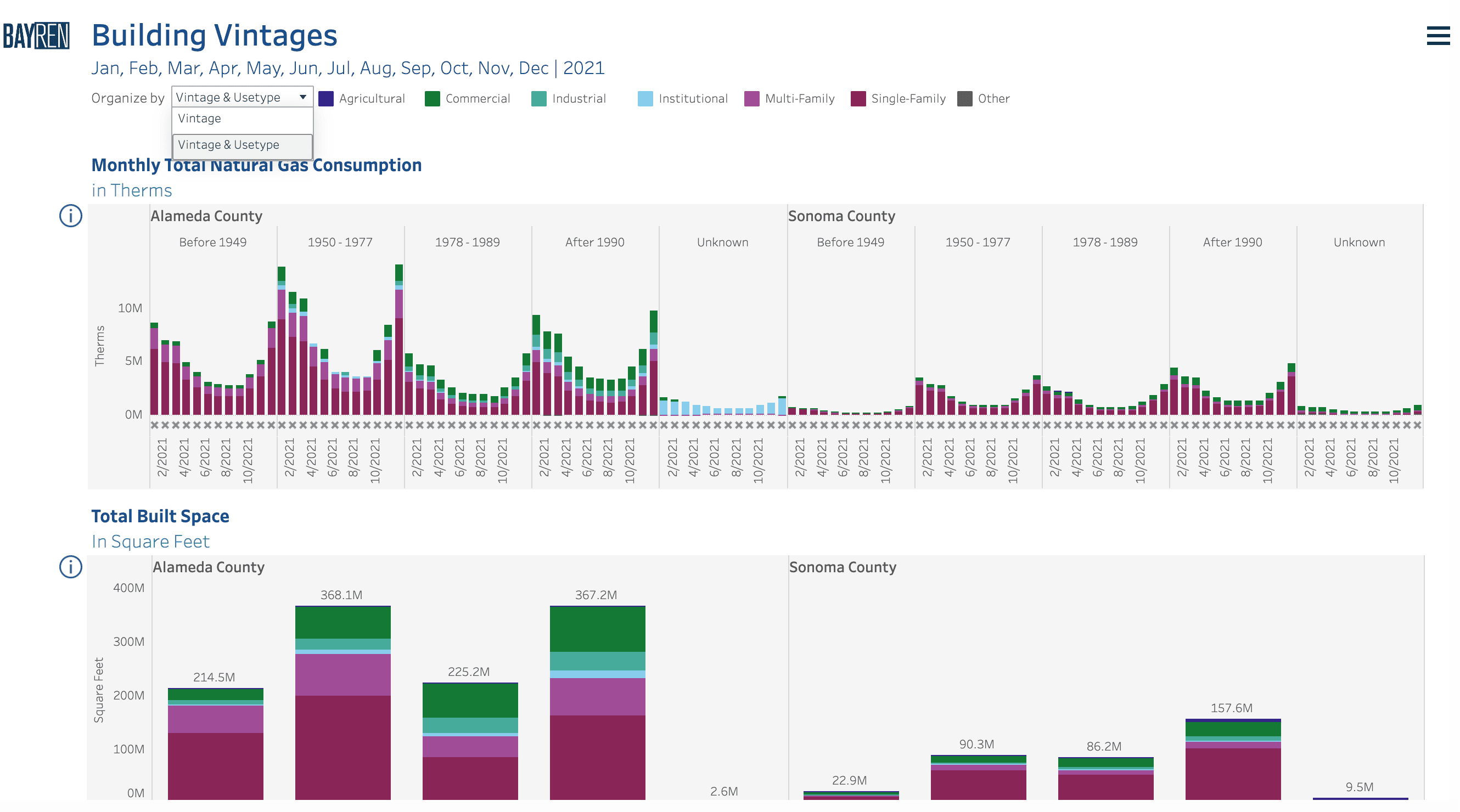
For several of the visualizations, there is an additional option to choose how to view the data. For instance, in the Building Vintage section, the graphs or the tables can be organized by Vintage:
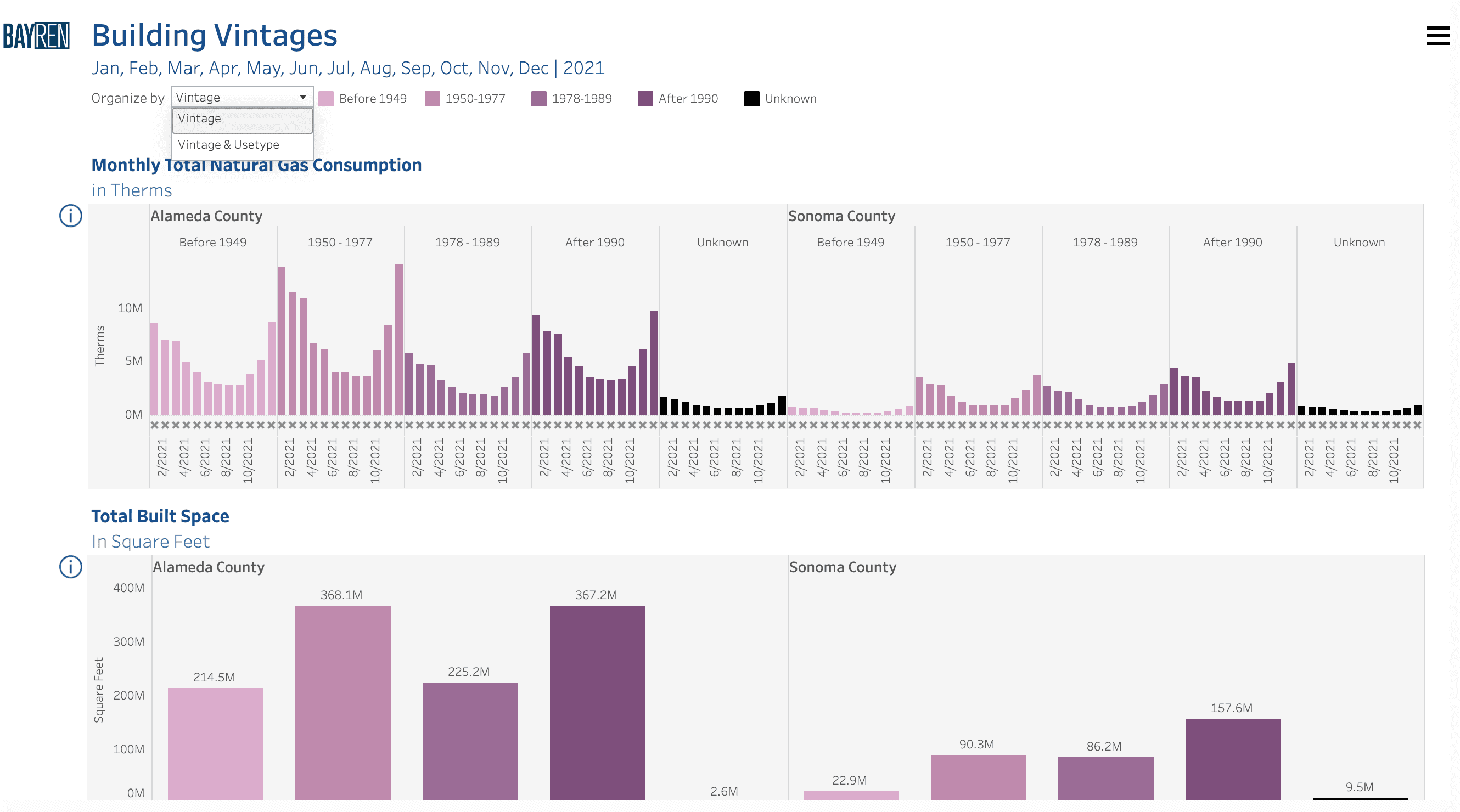
Or by both Vintage and Usetype:
How do I interpret masked data on the Profiles page?
When an “x” appears in a graph or table, that is an indication that masked data is present.
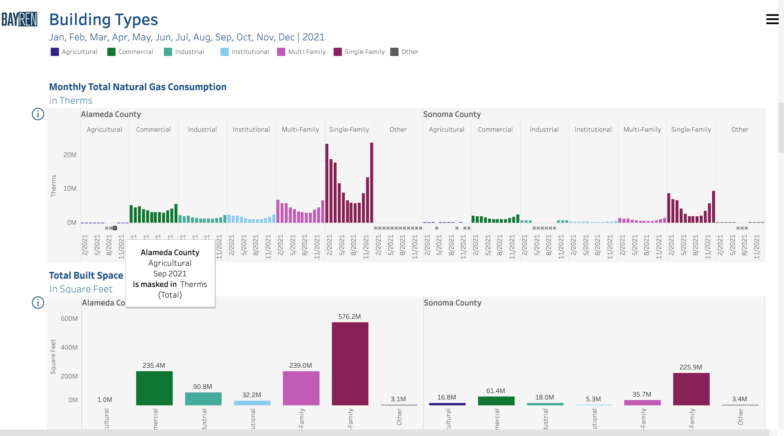
When examining the graphs of Building Vintage, Building Size, Residential Income, and CalEnviroscreen scores, a masking indicator may be present, but will not specify in which use type category the masking may occur.
To get the most detailed information on the origin of masking, follow these steps:
- If more than one geography is selected, use the compare option
- View the Profiles page as tables, and
- Choose to organize by both the relevant category and use type
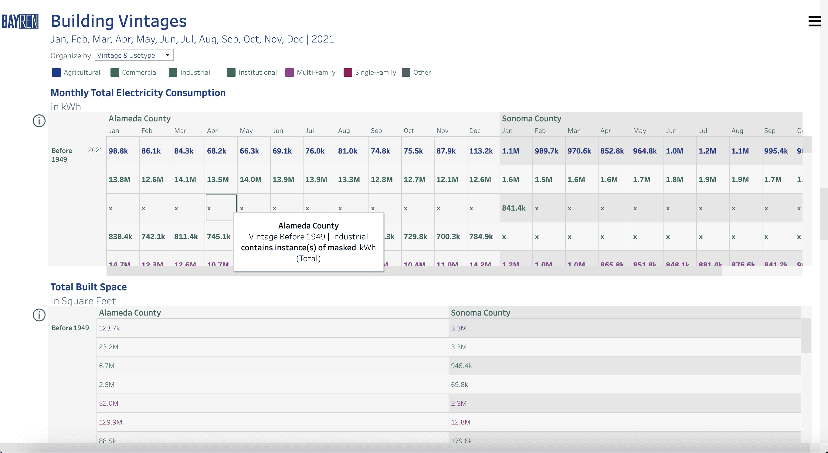
Where the bar chart indicated that masking was present somewhere in Alameda County for April 2021 and buildings built before 1949, the table makes clear that the masking orginiated with the consumption associated with the industrial use type.
How do I access CalEnviroscreen scores along with the consumption data?
There are two ways in which CalEnviroscreen 4.0 data are incorporated into the atlas.
-
The first is via the map pages. By default, the CalEnviroscreen 4.0 map layers are hidden. By opening the Layer Control menu in the map menu near the top left of the map area, the option to show DAC (DAC Census Tracts) and Non-DAC (Non-DAC Census Tracts) geographies will become available. These layers are meant for context. Turning them on will prioritize their tooltips upon hover.
See How do I control the visibility of map layers for more details.
-
The second is through the Profiles page. The final two graphs of the Profiles page provide data on consumption and population per CalEnviroscreen 4.0 score quartiles.
- NOTE: The population graph is not currently available pending a data processing update.
Because Cities and Zip Code Tabulation Areas do not necessarily align with Census Tracts, these visualizations will only populate when viewing Census Tracts or Counties.
Downloading data
How do I download the data?
To download the data that drive the public atlas tool, navigate directly to the Data Download page from the main menu. The data download page provides access to the data repository as well as an overview of the data strucure.
How do I download the visualizations from the Profiles page?
For data specific to the current view in the Profiles page, users can use the powerpoint download option available in the upper right-hand corner of the Profiles page. We are providing this option as it allows users to isolate individual visualizations as images in addition to the entire page of visualizations as an image.

-
PowerPoint: Download selected sheets as images on individual slides in a PowerPoint presentation.
To produce individual images, rather than an image of the entire page, select Specific sheets from this dashboard.
Any filters, parameters, or selections currently applied to the page are reflected in the exported presentation. The generated PowerPoint file includes a title slide and the date the file was generated. The title is a hyperlink that opens the workbook in Tableau Cloud or Tableau Server, rather than the official Bay Area Energy Atlas website. To help us track use of the atlas, please navigate to the original Bay Area Energy Atlas site for continued exploration.